
Campaign visual · Shell Box Argentina
Shell × Ferrari Innovation Partner — Collectibles campaign
CTR TO REDEMPTION
+18%
Click-through from Home / My Points to redemption flow
DETAIL → REDEEM
+12%
Conversion from product detail to initiating redemption
SUPPORT TICKETS
−20%
Estimated reduction in ops doubts and user complaints
DEV REWORK
−25%
Less late-stage rework by covering states from day 1
Context
A premium campaign with a
complex flow.
Shell Box is Argentina's loyalty and payments app. Ferrari collectibles campaign aimed to increase point usage through aspirational redemption — trade Shell points for limited-edition Ferrari miniature cars.
Two-entry-point structure: users access from a fuel charge moment, or redeem directly without loading up. Two valid paths, same product — experience had to be consistent, clear and trustworthy across both.
Previous promotions suffered from low/irregular conversion. Not because incentive wasn't strong enough — but because the interface failed to communicate value, and the flow broke under real-world states.
⛽
Path A — Fuel first
User loads fuel → earns points → prompted to redeem for Ferrari car during or after transaction.
🏎️
Path B — Direct redemption
User goes straight to redeem without loading fuel. Same destination, different entry point.
🎯
The design challenge
Two entry points, one consistent experience. Every state covered: stock limits, insufficient points, eligibility, expiry, errors, retries — from day 1.
The problem
Hype gets attention.
Clarity gets conversions.
Previous promos struggled with conversion inconsistency. Root causes: value not legible, flow didn't survive its own rules, UI communicated excitement without trust.
For Ferrari — brand that trades on aspiration and precision — clarity over hype was the core principle. Ferrari adds desire. UX sustains confidence.
PROBLEM 01
Low value legibility
Users couldn't instantly understand: what do I get, what does it cost in points, can I do it now?
PROBLEM 02
Broken under real states
Insufficient points, out of stock, redemption errors — none handled clearly. Every edge case became a drop-off.
PROBLEM 03
Premium feel vs usable flow — false tradeoff
Previous attempts either over-styled at the expense of clarity, or stayed plain and lost the Ferrari moment. Answer: Ferrari aesthetics inside Shell's consistent layout system.
The flow
End-to-end.
Every state covered.
The entire redemption journey designed as a single connected flow — from the first decision moment to the post-redemption proof. Six stages, two entry points, one consistent logic.
01
Home
Entry point. Ferrari module visible on load. Strong hierarchy, clear CTA to start the campaign.
02
My Points
Second entry path. User checks balance and sees redemption options tied to their current points.
03
Promo page
Ferrari brand moment. Campaign context, product showcase and value proposition before committing.
04
Confirm + states
Pre-commit screen. All edge cases: insufficient points, out of stock, redemption error, retry.
05
Checkout
Purchase summary before final confirmation. Points deducted, product selected, terms visible — no surprises.
06
Receipt
Post-redemption proof. What was redeemed, when, where to use it, current status. Eliminates support tickets.
Design decisions
What I actually built
and why.
01
Decision-first entry points
Home and My Points modules redesigned with a single question: "Redeem now or browse first?" Strong hierarchy on point cost, availability and CTA — before any Ferrari visual flourish.
02
Layered Ferrari aesthetic inside Shell's layout
Ferrari visual identity (red, racing imagery, premium) applied as a layer on Shell Box's consistent layout — not replacing it. Premium brand moment without sacrificing usability or scalability.
03
Catalogue and detail designed to reduce uncertainty
Every car card answers four questions immediately: what do I get, how many points, is it available, can I do it now. Detail adds: exact rules, stock count, how the voucher works.
04
Confirmation as trust moment — not friction
Confirmation makes the exchange explicit: these points → this car. Edge cases inline: insufficient points shows exactly how many are missing. Stock exhausted redirects gracefully.
05
Comprobante as self-service support
Post-redemption screen answers proactively: what was redeemed, when, where to use it, current status. Users don't contact support because the interface already answered.
06
Edge cases from day 1
All states designed before closing UI. Reduced dev/QA rework by ~25% — engineering never had to improvise states that weren't spec'd.
UI screens · Shell × Ferrari


Home
Brought Ferrari branding into the home with stronger hierarchy and clearer conversion entry points.
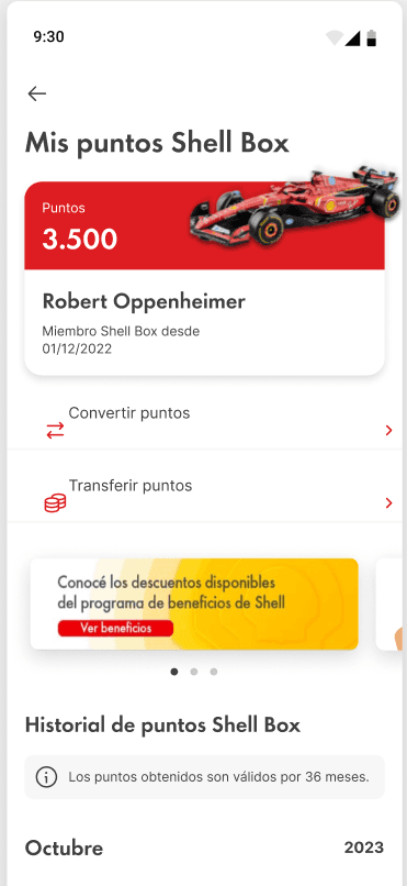
My Points
Extended the campaign into rewards and points to keep value visible beyond the first touchpoint.

Voucher
Clarified voucher and checkout moments to reinforce the benefit right before payment.
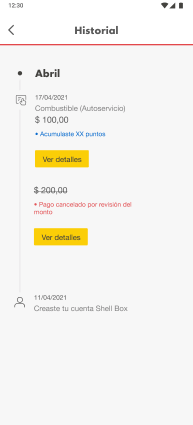
Transaction History
Made promotional transactions easier to identify and verify after purchase.
Full Figma file available during interview under NDA.
Results
What moved
after launch.
These are internal proxies — not published analytics. They reflect the pattern of improvement seen across similar campaigns redesigned with the same methodology.
+18%
CTR to redemption from Home / My Points
Decision-first modules with strong hierarchy on point cost and availability drove more users from browsing to actively starting the redemption flow.
Proxy · Internal estimate
+12%
Conversion — car detail to initiating redemption
Clearer value communication on the detail screen reduced hesitation before commitment.
−20%
Estimated reduction in support tickets
Better comprobante design, explicit state handling and clearer microcopy — users could self-serve.
−25%
Less dev and QA rework on late-stage fixes
All states defined before closing UI. Engineering never had to improvise. Fewer surprises in QA.
Key principles
What this case runs on.
✨
Clarity over hype
Ferrari adds desire. UX sustains confidence. The aesthetic serves the brand — the flow serves the user.
🔀
Two paths, one logic
Fuel-first and direct redemption share the same visual system. No parallel experiences, no inconsistency.
🧱
Edge cases from day 1
States and errors designed before closing UI. What separates a flow that ships well from one that breaks in QA.
⚙️
Dev-friendly by design
Reusable components, documented variants, clear content rules. Handoff gave engineering a reliable spec to build from.
📋
Comprobante as self-service support
Post-redemption screen designed to answer the questions users would otherwise ask support.
🌎
Cross-country alignment
Designed in alignment with Shell Box Brazil — same component logic, same redemption patterns.
"An aspirational promotion doesn't convert on aesthetics alone. It converts when the user understands the value, trusts the exchange — and the flow holds up under real states without breaking."
Shell × Ferrari · Points redemption case
Tom Oliva
oliva.tomas@gmail.com
designer-tom.com
Work / Shell × Ferrari · Points redemption
Loyalty
Conversion
Shell Box Argentina
Mobile UI
End-to-end UX
Aspiration needs
a flow that
holds up.
Shell Box Argentina launched a Ferrari collectibles campaign — redeem loyalty points for miniature Ferrari cars. Aspirational promotions only convert when the user understands the value, trusts the exchange, and the flow survives real states and edge cases. That's what I designed.