Context
A fintech product without a shared
visual language.
Ewally is a digital wallet and banking platform within Carrefour Group — Pix payments, card management, transfers, credit, financial services for B2C and B2B.
When I joined, significant UI inconsistency had accumulated. Components varied between flows, patterns weren't documented, every new feature required solving the same problems from scratch. Slow delivery, visual debt, product felt incoherent.
The opportunity: build a design system as single source of truth — and raise quality of everything built on top.
💳
The product
Digital wallet, Pix, transfers, cards, credit — full financial stack for B2C and B2B users.
🧩
The problem
No shared component library. Inconsistent patterns. Slow delivery, visual debt accumulating.
🎯
The goal
Build a design system from scratch that unified the product, accelerated delivery and gave engineering a reliable, documented component library to build from.
Blu Design System
Built on three pillars.
Blu was designed around three principles that reflected what the product team actually needed.
01
Efficiency
Reusable components and documented patterns reduced time to design and build. One decision made once — applied everywhere.
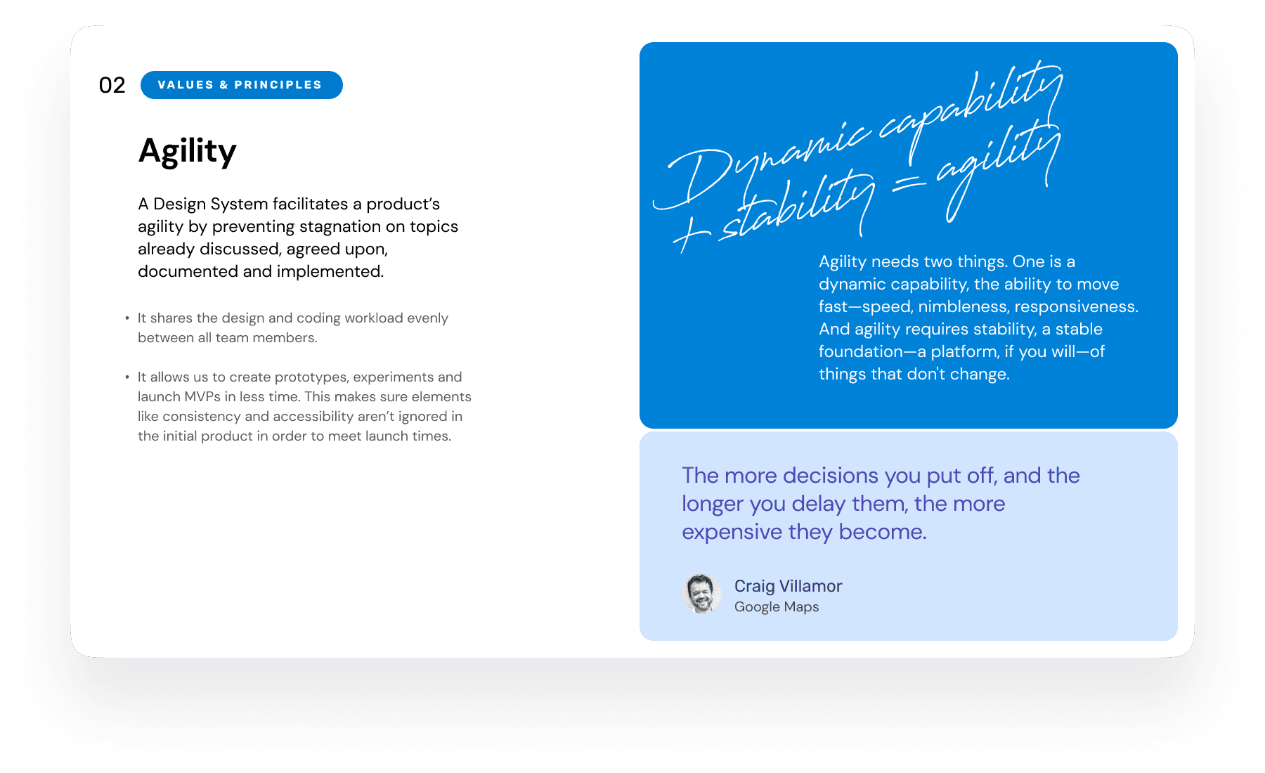
02
Agility
Faster iteration cycles. Designers prototype at speed, engineers implement with confidence. Less back-and-forth, more shipping.
03
Quality
Consistent accessibility, predictable states, clear error handling. The system raised the floor — and the ceiling.
Design system documentation

Design system overview and foundations

Efficiency — reusable patterns
Agility — faster delivery

Quality — consistency and accessibility
Component states and variants
Token system and color variables

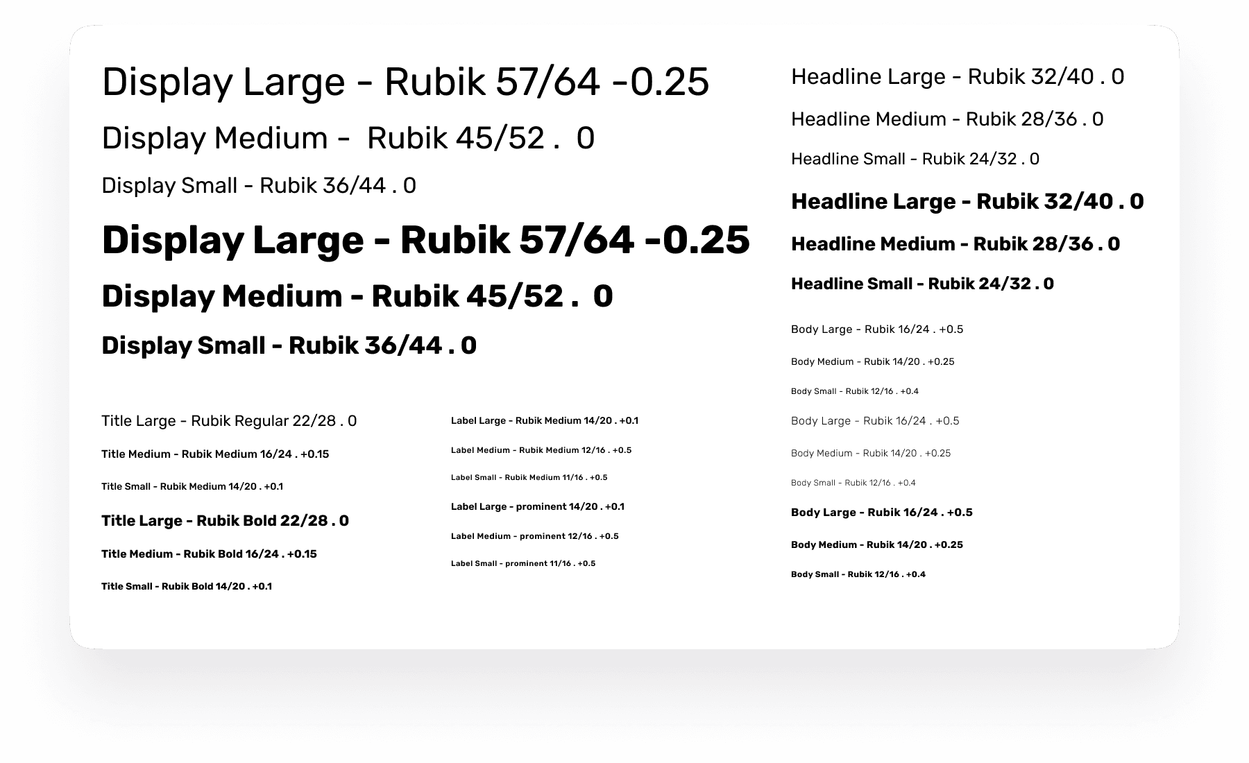
Typography scale

Icon library and assets

Spacing and grid system

Component patterns and usage rules
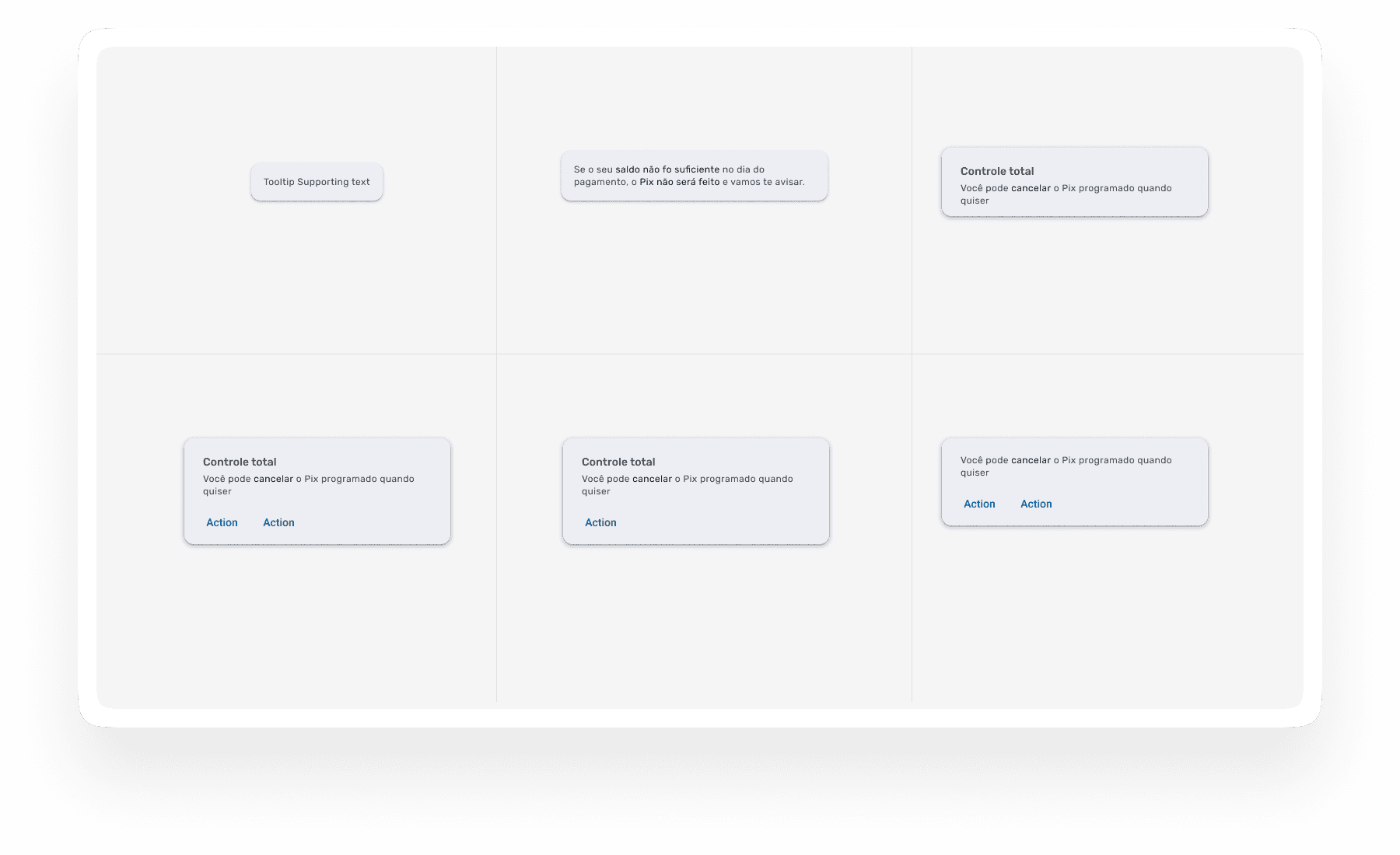
States, feedback and error handling

Governance and documentation
How I built it
From visual debt to
single source of truth.
01
Audit of existing UI
Catalogued full product to map inconsistencies — duplicate components, undocumented patterns, color and spacing variations.
02
Foundation on Material 3
Chose Material 3 as base for Blu — familiar mental model for engineering, accelerated implementation, customized to Ewally's brand and product needs.
03
Token system and variables
Built token system for colors, typography, spacing, border radius — decoupled from components. Theming and dark mode support at token level.
04
Component library with full state coverage
Each component documented with all states: default, hover, focus, active, disabled, loading, error, empty. No component shipped without failure modes defined.
05
Engineering partnership
Worked directly with developers — usage rules, accessibility specs and variant logic documented in Figma. Handoff wasn't a file, it was an ongoing collaboration.
06
Governance and maintenance
Contribution guidelines so the system could grow without fracturing. New components through review before being added.
App UI
The system in production.
The design system powered the full consumer app. Every screen below was built using Blu components, tokens and patterns.

Home · Payment QR · Credit Cards · Receipt — all surfaces built on the Blu Design System
HOME SCREEN
Balance, actions, next steps — at a glance
Hierarchy for high-frequency use. Primary balance immediately visible, key actions one tap away.
PAYMENT QR
Short guidance, clear validation, reliable feedback
Every state — scanning, confirming, error — designed explicitly. No ambiguity at the critical moment.
CREDIT CARDS
Unified card actions, predictable and secure
Physical and virtual cards with identical interaction patterns. Consistent flow, no surprises.
RECEIPT
Fast scanning, better trust
Transaction history designed for verification speed. Confirm a transfer in seconds, not minutes.
Beyond the brief
Three visual directions
outside my role.
🎨
Ewally asked me to develop 3 visual strategies for the digital banking app — not just UX/UI, but also integrating the brand's new visual identity. This was outside the typical Product Designer scope. I took it on as a demonstration of what 10+ years of visual design background makes possible.
Branding Directions Image

Three visual strategies: Corporate · Friendly · Elegance
"10+ years in visual design don't disappear when you become a Product Designer. They become your edge."
Personal approach — Ewally branding directions
🏛️
Corporate
Professional, structured, confidence-inspiring. Designed for B2B and enterprise clients where trust and authority are the primary signals.
👋
Friendly
Approachable, human, accessible. For B2C users new to digital banking — warmth and clarity as primary drivers.
✨
Elegance
Premium, refined, sophisticated. For users who expect their financial app to feel as polished as their other lifestyle choices.
Impact
What the system unlocked.
A design system's impact is measured in what it prevents as much as what it enables. Before Blu, every new feature required solving the same foundational questions. After Blu, those questions had answers — documented, accessible and shared.
Delivery speed increased because designers and engineers started from a stable base. Consistency improved because components were designed once, with all states covered, and reused everywhere. The product started feeling like a product.
Because the system was built with engineering as a partner — not a downstream recipient — the gap between design and implementation narrowed significantly.
DELIVERY
Faster shipping
Less time solving solved problems. More time on new product decisions.
CONSISTENCY
One source of truth
Every surface — app, portal, B2B, B2C — aligned to the same patterns.
TEAM CAPABILITY
Eng + Design alignment
Components documented with states, variants and usage rules. Engineers implement confidently. Designers iterate quickly. The system made collaboration the default.
Reflection
What building a system
teaches you.
A design system is the closest thing to product infrastructure that a designer can build. It's not a deliverable — it's a bet on the future.
The hardest part isn't the components. It's the discipline of making decisions that will hold across contexts you haven't designed for yet. That requires thinking like a systems architect, not just a screen designer.
The visual design background that predates the product career turned out to be a genuine advantage — not just for the branding directions, but for the quality of the system itself. Typography choices, color relationships, spatial rhythm — those are foundational to system design.
Tom Oliva
oliva.tomas@gmail.com
designer-tom.com
Work / Ewally · Blu Design System
Design System
Fintech
Ewally · Carrefour Group
Material 3
B2C / B2B
Building the
foundation for
fintech at scale.
At Ewally (Grupo Carrefour, Brazil), I led UX/UI for a digital wallet and banking app — and built Blu, a Material 3-based design system that unified the product, accelerated delivery and raised the quality bar across every surface.
COMPANY
Ewally
Fintech SaaS · Grupo Carrefour · Brazil
OUTPUT
Blu DS
Design system built from scratch on Material 3
PILLARS
3
Efficiency · Agility · Quality
SCOPE
B2C + B2B
App + Portal · Full product coverage