Context
One task.
Almost a full workday.
Shell Box Argentina's internal backoffice had one operational task that consumed roughly 12 hours from start to finish. It wasn't a complex task. It was a fragile, confusing interface layered over simple operations.
Nobody had flagged it as a design problem. The team had just normalized the workarounds, the double-checking, the manual error handling. It was the way things worked.
I partnered directly with the main user — Trini, the primary backoffice operator — to map the pain, redesign the flow, and validate every change against her real workflow.
BEFORE
~12h
· Confusing, fragile UI
· No feedback on state changes
· Repeated errors and re-checks
· Manual workarounds to complete tasks
· Low trust in the system
AFTER
~2h
· Clearer flow and state visibility
· Explicit feedback at each step
· Reusable components, consistent patterns
· No workarounds needed
· Team trusts the system output
Research
I started by
watching Trini work.
I sat with Trini — Shell Box Argentina's primary backoffice operator — and watched her complete the full operation without interrupting. No workshop. No survey. Just observation.
The gap wasn't between the user and the tool. It was between the system's internal logic and the operator's mental model. The interface assumed a sequence that didn't match how the work actually flowed.
T
Trini
Operations · Shell Box Argentina · Primary user
The main operational user of the BKO. Every discovery session, every usability test, every redesign decision was validated against her real workflow — not a hypothetical user journey.
"The interface assumed a sequence that didn't match how the work actually flowed."
Research finding — direct observation sessions
Process
How I found the problem — and
fixed it.
01
Direct observation
Watched Trini complete the full operation without interrupting. Mapped every step, pause, workaround.
02
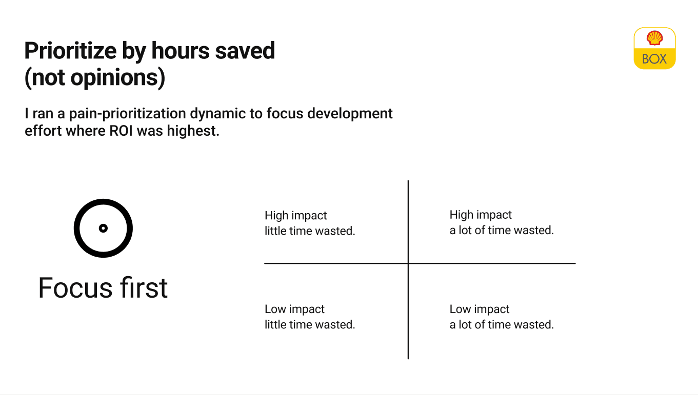
Pain point prioritization
Extracted friction points and ranked by frequency and impact. Focused on what compounded over time.
03
Usability tests on existing flow
Structured sessions to validate pain points. Confirmed systematic failures in feedback, state visibility and flow logic.
04
Flow and state redesign
Redesigned end-to-end flow: explicit state visibility, clear feedback, sequence matching operator's mental model — not the system's internal logic.
05
UI and component redesign
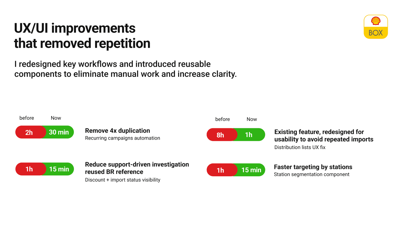
Rebuilt key screens with reusable components, consistent validation and clearer error states. Designed for high repetition, low error tolerance.
06
Validation and handoff
Validated redesign with Trini before handoff. Design QA post-release, not just before.
Case documentation · 6 slides

01 — Context and problem framing

02 — Research and user observation

03 — Pain point mapping and prioritization
04 — Flow and state redesign
05 — UI and component solutions

06 — Impact and results
Design decisions
What actually
moved the number.
👁️
State visibility
Every step now shows explicit status. Operators stopped second-guessing whether an action had worked.
✅
Validation at the right moment
Moved validation from end-of-flow to inline, catching errors before they compounded.
🔁
Reusable patterns
Repeated actions had consistent behavior. Operators built muscle memory — reducing cognitive load on every cycle.
🚫
Eliminated workarounds
Every documented workaround became a design requirement. If ops invented a workaround, the interface had failed.
🧱
Error states that help, not block
Error messages rewritten to explain what went wrong and what to do next. Ops could resolve without escalating to support.
🤝
Engineering partnership
Design QA post-release. Iterated on edge cases that only surfaced in production.
Impact
More than
a faster flow.
The redesign freed ~10 hours per cycle. That's 10 hours that could go toward higher-value work instead of babysitting a fragile interface.
More importantly, the team started trusting the system. When the interface gives clear feedback and validates inline, operators stop second-guessing and start executing.
Errors and escalations dropped. The backoffice stopped being something to endure and became a tool they could rely on.
TIME SAVED
~10h per operation
Freed for higher-value work per cycle.
RELIABILITY
Reduced rework
Clearer states and validation meant fewer errors reaching the end of the flow.
SYSTEMIC OUTCOME
The team trusts the system
When the interface gives clear feedback, operators stop second-guessing and start executing.
"The team stopped treating the backoffice as something to be endured."
Post-launch observation
Reflection
What this case taught me.
Internal tools are invisible in portfolios. They don't photograph well. They don't win awards. But they're where real operational impact happens — the kind that frees people from wasting time on bad interfaces.
This case taught me the discipline of sitting with one user and watching, not workshopping or surveying. Trini's workflow was the ground truth. Every design decision had to pass through her real operations, not a hypothetical journey map.
The −83% makes the responsibility feel real. That's 10 hours per cycle, compounded over weeks, months. When you see that number, you can't design carelessly.
← Previous case
One product, two countries: one shared vision
The bi-national discovery that powered this redesign. How I aligned Business, Tech and UX across Brazil and Argentina — in two languages.
BR↔AR
Bi-national discovery
Tom Oliva
oliva.tomas@gmail.com
designer-tom.com
Work / 12h → 2h · BKO redesign
Backoffice
Workflow redesign
Shell Box
UX Research
Operational impact
From
12 hours
to 2 hours.
One operational task in Shell's internal backoffice was consuming almost an entire workday. I partnered with the main user, mapped the pain, redesigned the flow — and cut the process time by 83%.
BEFORE
~12h
End-to-end cycle time per operation
AFTER
~2h
Same operation, redesigned flow
REDUCTION
−83%
Cycle time eliminated
METHOD
Research-led
Direct observation + usability testing with real users
Context
One task.
Almost a full workday.
Shell Box Argentina's internal backoffice had one operational task that consumed roughly 12 hours from start to finish. It wasn't a complex task. It was a fragile, confusing interface layered over simple operations.
Nobody had flagged it as a design problem. The team had just normalized the workarounds, the double-checking, the manual error handling. It was the way things worked.
I partnered directly with the main user — Trini, the primary backoffice operator — to map the pain, redesign the flow, and validate every change against her real workflow.
BEFORE
~12h
· Confusing, fragile UI
· No feedback on state changes
· Repeated errors and re-checks
· Manual workarounds to complete tasks
· Low trust in the system
AFTER
~2h
· Clearer flow and state visibility
· Explicit feedback at each step
· Reusable components, consistent patterns
· No workarounds needed
· Team trusts the system output
Research
I started by
watching Trini work.
I sat with Trini — Shell Box Argentina's primary backoffice operator — and watched her complete the full operation without interrupting. No workshop. No survey. Just observation.
The gap wasn't between the user and the tool. It was between the system's internal logic and the operator's mental model. The interface assumed a sequence that didn't match how the work actually flowed.
T
Trini
Operations · Shell Box Argentina · Primary user
The main operational user of the BKO. Every discovery session, every usability test, every redesign decision was validated against her real workflow — not a hypothetical user journey.
"The interface assumed a sequence that didn't match how the work actually flowed."
Research finding — direct observation sessions
Process
How I found the problem — and
fixed it.
01
Direct observation
Watched Trini complete the full operation without interrupting. Mapped every step, pause, workaround.
02
Pain point prioritization
Extracted friction points and ranked by frequency and impact. Focused on what compounded over time.
03
Usability tests on existing flow
Structured sessions to validate pain points. Confirmed systematic failures in feedback, state visibility and flow logic.
04
Flow and state redesign
Redesigned end-to-end flow: explicit state visibility, clear feedback, sequence matching operator's mental model — not the system's internal logic.
05
UI and component redesign
Rebuilt key screens with reusable components, consistent validation and clearer error states. Designed for high repetition, low error tolerance.
06
Validation and handoff
Validated redesign with Trini before handoff. Design QA post-release, not just before.
Case documentation · 6 slides
Design decisions
What actually
moved the number.
👁️
State visibility
Every step now shows explicit status. Operators stopped second-guessing whether an action had worked.
✅
Validation at the right moment
Moved validation from end-of-flow to inline, catching errors before they compounded.
🔁
Reusable patterns
Repeated actions had consistent behavior. Operators built muscle memory — reducing cognitive load on every cycle.
🚫
Eliminated workarounds
Every documented workaround became a design requirement. If ops invented a workaround, the interface had failed.
🧱
Error states that help, not block
Error messages rewritten to explain what went wrong and what to do next. Ops could resolve without escalating to support.
🤝
Engineering partnership
Design QA post-release. Iterated on edge cases that only surfaced in production.
Impact
More than
a faster flow.
The redesign freed ~10 hours per cycle. That's 10 hours that could go toward higher-value work instead of babysitting a fragile interface.
More importantly, the team started trusting the system. When the interface gives clear feedback and validates inline, operators stop second-guessing and start executing.
Errors and escalations dropped. The backoffice stopped being something to endure and became a tool they could rely on.
TIME SAVED
~10h per operation
Freed for higher-value work per cycle.
RELIABILITY
Reduced rework
Clearer states and validation meant fewer errors reaching the end of the flow.
SYSTEMIC OUTCOME
The team trusts the system
When the interface gives clear feedback, operators stop second-guessing and start executing.
"The team stopped treating the backoffice as something to be endured."
Post-launch observation
Reflection
What this case taught me.
Internal tools are invisible in portfolios. They don't photograph well. They don't win awards. But they're where real operational impact happens — the kind that frees people from wasting time on bad interfaces.
This case taught me the discipline of sitting with one user and watching, not workshopping or surveying. Trini's workflow was the ground truth. Every design decision had to pass through her real operations, not a hypothetical journey map.
The −83% makes the responsibility feel real. That's 10 hours per cycle, compounded over weeks, months. When you see that number, you can't design carelessly.
← Previous case
One product, two countries: one shared vision
The bi-national discovery that powered this redesign. How I aligned Business, Tech and UX across Brazil and Argentina — in two languages.
BR↔AR
Bi-national discovery